
I've been playing around with my Copic Markers lately coloring stamped images. I love that I can customize the stamp design to whatever it is that I'm working on, coordinating colors or themes, etc. To create the card, I used papers from Graphic 45's Tropical Travelogue line, which is so luscious. I can't wait to get some of my Hawaii pics scrapped with this paper. In this post, I'm going to describe how I created the colored images for this fun card.
I first stamped the image that I wanted to color several times onto Strathmore Bristol paper. This is a heavyweight paper that can handle the "juiciness" of the Copic markers. If you really saturate the paper, it will bleed through, so I recommend using a craft mat under your paper to protect your work surface. When I'm using Copics, I stamp my images using Ranger Distress Ink. I stamp the image multiple times (in case I screw up and want to start over), and then let the ink dry for several minutes so it doesn't streak or bleed once I start coloring. The stamp I used is from a set by Graphic 45 for Hampton Arts that I purchased at Michael's. The stamped image is about 3" tall and about 1" wide.
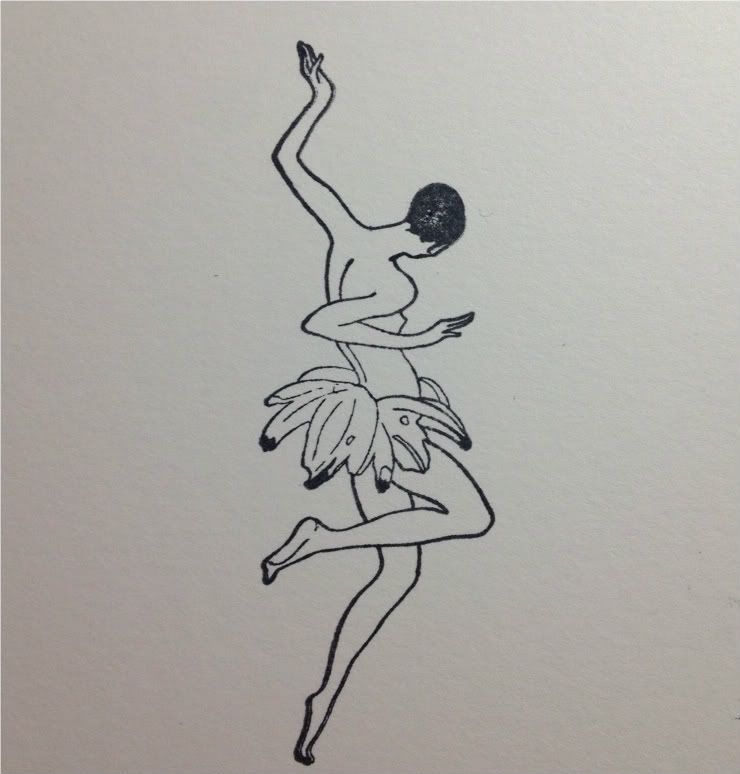 This image has two parts that will need to be colored: The skin tone and the bananas. I chose the markers you see here for my example, but for the actual card I created several combinations of skin tones. Each one uses two "E" shades that are in the same family.
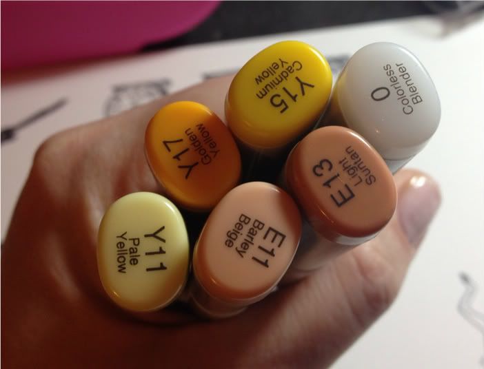
I began by using Y11 (Pale Yellow) to fill in the entire banana area, using circular swirls to saturate the paper and the tip of the pen to reach tight areas.
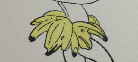
I then used Y15 (Cadmium Yellow) and Y17 (Golden Yellow) to draw lines on the undersides of the bananas or where there would be shadows. I used Y15 more liberally than Y17.

I then went back over the whole banana area with Y11 to soften and blend the deeper colors.

Next, onto the skin tones. For this example, I used E11 (Barely Beige) and E13 (Light Suntan). I began by filling in the entire body shape with E11, then using E13 to create a shadow line on the back of the body and where there were overlaps.
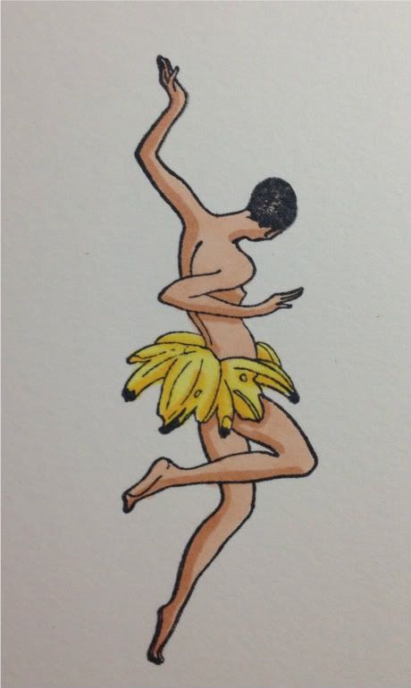
This on its own gives an interesting effect, but I wanted to soften the gradation a bit, so I used E11 to blend the darker E13.
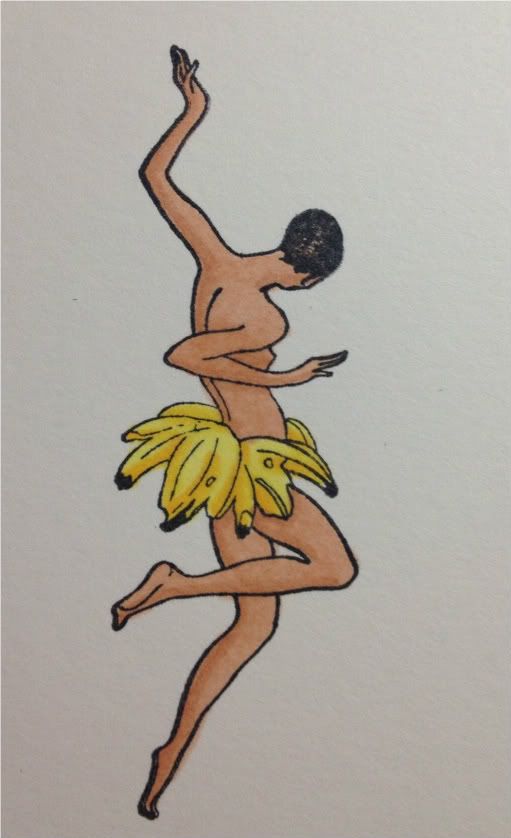 Finally, I used the Colorless Blender to touch up some areas where I went outside the line. The Colorless Blender is not an eraser, but it acts as a thinner and moves the excess ink away, making your mistakes less noticeable. I then trimmed this image down to use on my card.
No comments:
Post a Comment